TD SPOTLIGHT CASE STUDY
Redesigning internal trading tools to empower data-driven decisions at TDSecurities
Project overview
- Product: Spotlight - Internal financial dashboard web application
- Timeline: 2 years (1 year MVP development + ongoing iterations)
- Team: Cross-functional team with project manager, developers, and stakeholders
- Users: Internal TD Securities traders, relationship managers, salespeople, and analysts
My role
UX Design Lead
Tools
Sketch,Adobe XD, Photoshop, CSS, JavaScript
Methods and practices
User interviews, usability testing, analytics review
The challenge
TD Securities needed an internal tool to help traders, relationship managers, and salespeople make better data-driven decisions about client value and risk management. The existing workflow relied heavily on third-party solutions and fragmented data sources, making it difficult for teams to quickly assess client value across fixed income, institutional equities, foreign exchange, and prime brokerage.
Problem statement
How might we create an intuitive internal dashboard that consolidates Bloomberg and ION historical data to help TD Securities professionals quickly identify high-value clients and manage risk more effectively?
Research and discovery
- User Interviews: Conducted interviews with traders, relationship managers, and salespeople
- Usability Testing: Held sessions with junior traders to identify pain points
- Analytics Review: Analyzed existing workflow patterns and data usage
Key insights
- Multi-window Workflow Requirements
- Traders needed responsive design to support multiple simultaneous windows
- Current tools didn't integrate well with existing multi-monitor setups
- Data Prioritization Needs
- Users wanted clients ranked by calculated value for specific date ranges
- Quick visual hierarchy was crucial for time-sensitive trading decisions
- Trust & Adoption Barriers
- Senior traders showed resistance to new internal tools
- Junior traders and analysts were more open to workflow improvements
- Third-party solution familiarity created initial skepticism
Design Process
User-Centered Approach
Working closely with the project manager, I defined user needs through iterative feedback sessions.We prioritized getting core functionality in front of users quickly to validate our approach.
Information Architecture
I structured the application around key user workflows:
- Onboarding - Streamlined introduction to platform capabilities
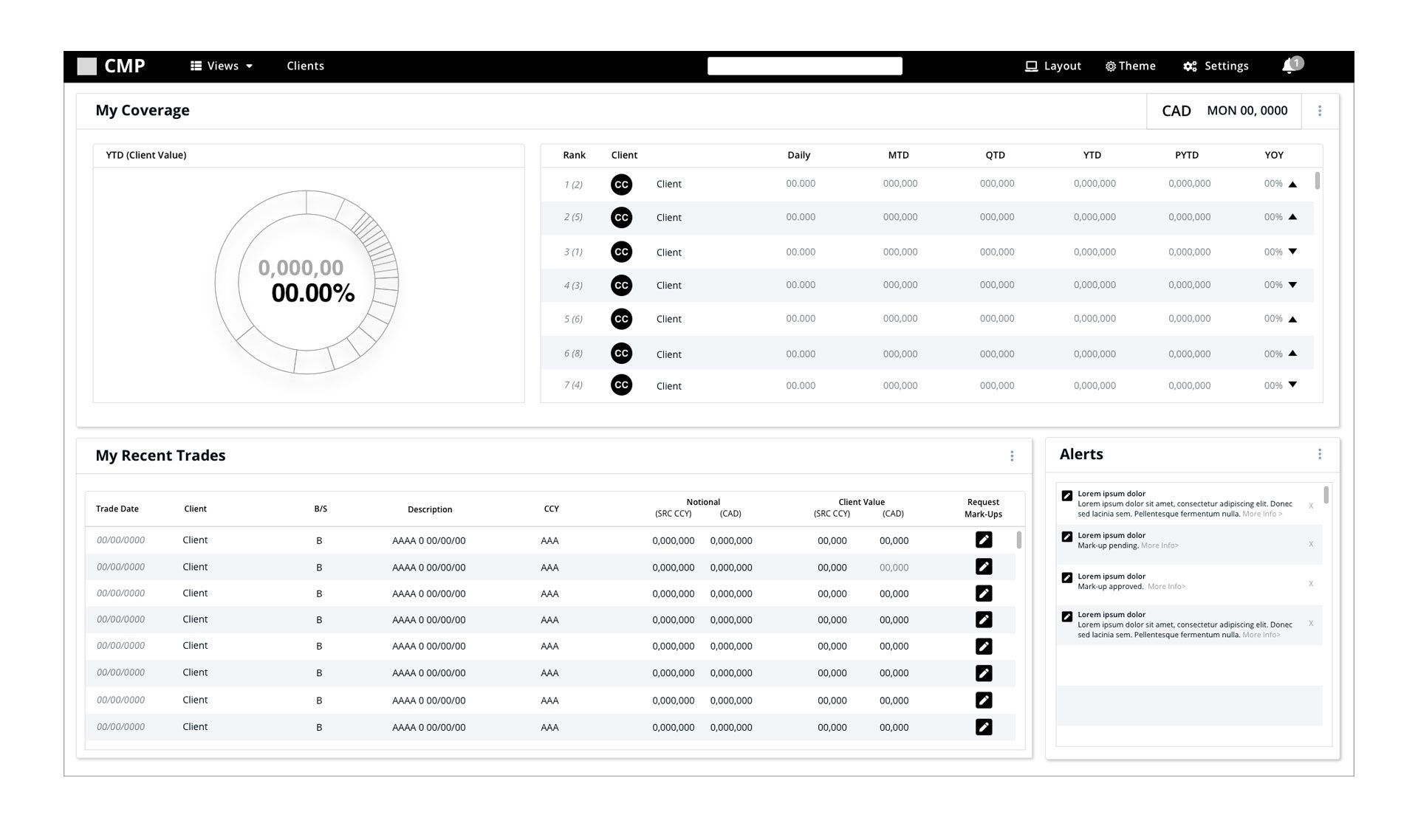
- Home Dashboard - Periodic table-style interface with clickable client cards
- Trader Dashboard - Role-specific view optimizing for trading workflows
- Client Profiles - Comprehensive customer and sub-customer data views
Design System Development

Created a comprehensive design system and CSS library to ensure consistency across the application while enabling rapid component development for our React-based platform.
Solutions

Core Features Delivered
- Interactive Home Dashboard
- Periodic table-style layout with clickable client cards
- Dynamic ranking based on client value calculations
- Customizable date range filtering
- Responsive design supporting multi-window workflows
- Role-Specific Dashboards
- Trader Dashboard: Optimized for quick risk assessment and client value analysis
- Sales Dashboard: Focused on relationship management and client maintenance
- Analytics Views: Detailed data exploration for analysts
- Comprehensive Client Management
- Senior traders showed resistance to new internal tools
- Junior traders and analysts were more open to workflow improvements
- Third-party solution familiarity created initial skepticism
- Workflow Integration Features
- Senior traders showed resistance to new internal tools
- Junior traders and analysts were more open to workflow improvements
- Third-party solution familiarity created initial skepticism
Design System Impact
The component library I developed accelerated development while maintaining design consistency,reducing design-to-development handoff time and ensuring scalable UI patterns.
Results & Impact
Success Metrics
- Primary Goal: User adoption in daily workflows
- Achievement: Secured significant early adopter base across the bank
- User Feedback: Positive reception from junior traders and analysts
Adoption Strategy Success
Despite initial resistance from senior traders familiar with third-party solutions, our targeted approach of engaging junior-level traders and analysts proved effective. These early adopters appreciated having new tools that could provide competitive advantages in their workflows.
Long-term Insights
The project ran for two years before discontinuation, providing valuable insights into internal tool adoption patterns and the importance of change management in established trading environments.
Visual Assets
- User journey maps
- Wireframe progressions
- High-fidelity prototypes
- Design system documentation
- Usability testing results
- Component library examples
Challenges & Learnings
Challenge: Overcoming Tool Resistance
- Problem: Senior traders preferred familiar third-party solutions
- Solution: Focused on junior traders and analysts who were more receptive to new tools
- Learning: Early adopter strategies can be crucial for internal tool success
Challenge: Complex Data Integration
- Problem: Consolidating Bloomberg and ION historical data into intuitive interfaces
- Solution: Created clear visual hierarchies and customizable ranking systems
- Learning: Financial data requires careful information design to support quick decision-making
Challenge: Multi-stakeholder Alignment
- Problem: Balancing needs of traders, salespeople, and relationship managers
- Solution: Role-specific dashboard views while maintaining consistent core functionality
- Learning: Flexible architecture allows for specialized experiences without fragmenting the product
Key Takeaways
- User-Centered Iteration: Regular usability testing with junior traders provided actionable insights that improved adoption
- Design System Value: Creating reusable components accelerated development and ensured consistency
- Change Management: Internal tool success depends as much on adoption strategy as design quality
- Data Visualization: Financial dashboards require careful balance of information density and usability
- Responsive Design: Multi-window support was crucial for trading environment integration